Bloom&Be

CREATIVE DIRECTION & BRAND DEVELOPMENT

One vision. Many expressions.

From the first concept to a cohesive brand identity, brought to life across every touchpoint.

website design

Learn More

SOCIAL MEDIA

Learn More

INFO-GRAPHICS

Learn More

IMAGE CREATION

Learn More

Contact me

Learn More

Developing the Brand Identity for


Target audience:
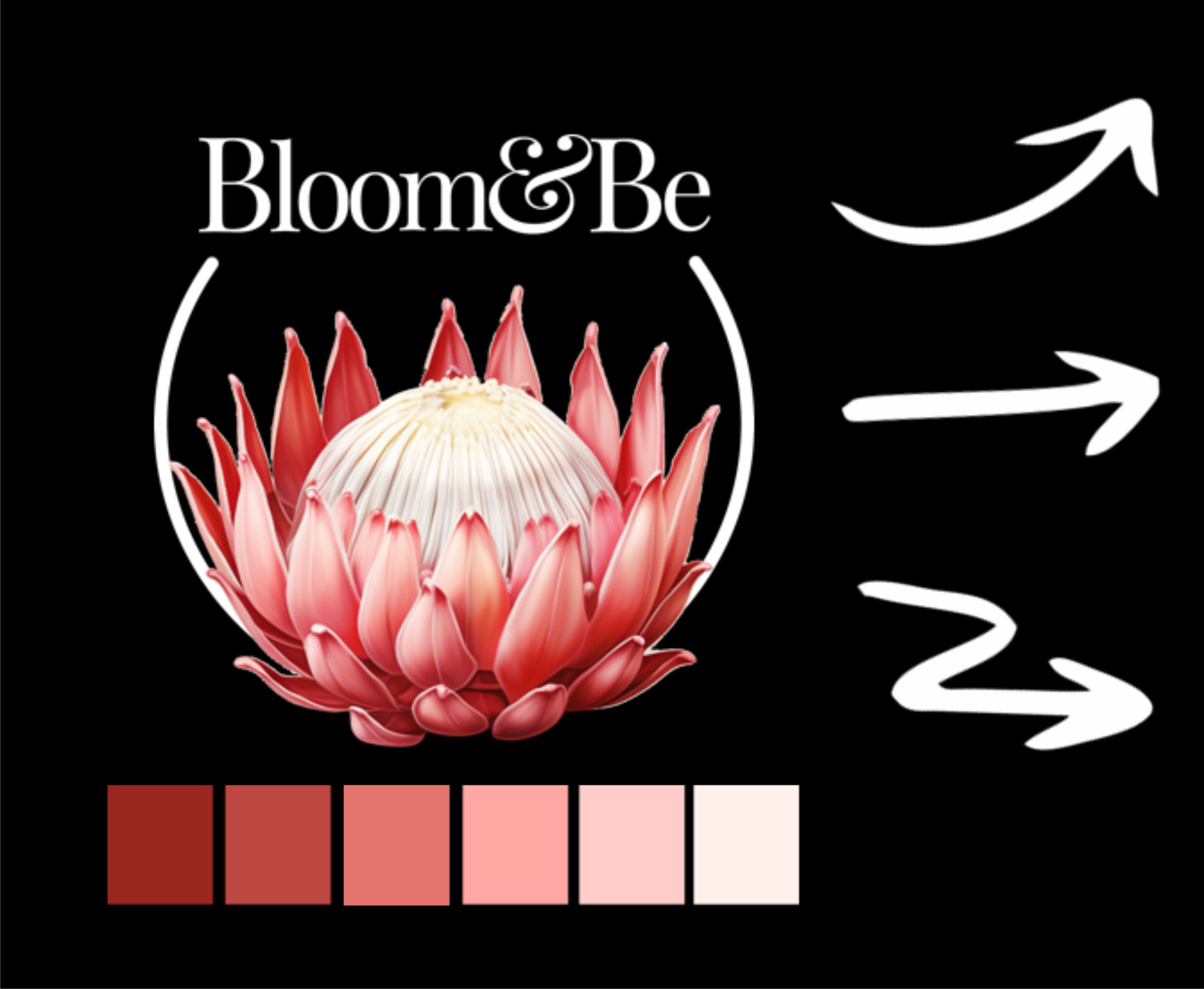
Women aged 20–50. The logo was designed with feminine typography and a refined colour palette, creating a modern, distinctive, and memorable brand identity.

Brand identity:
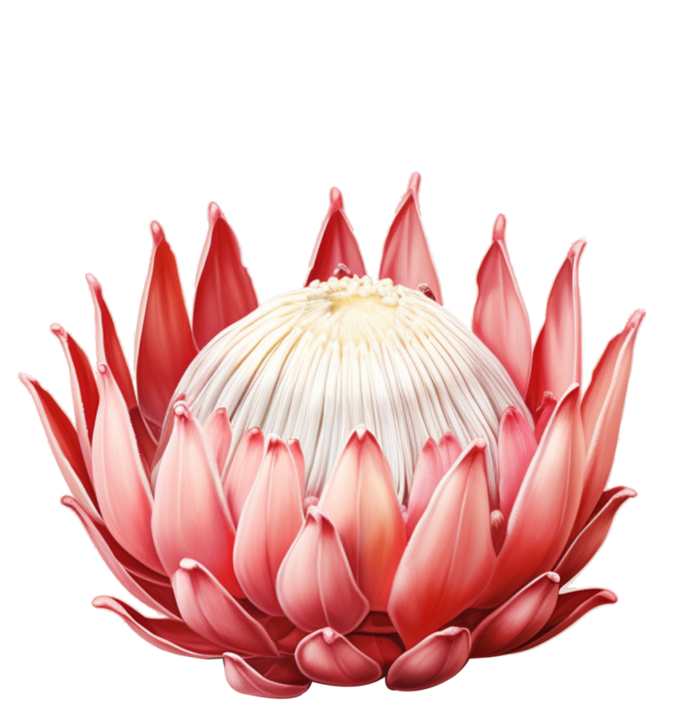
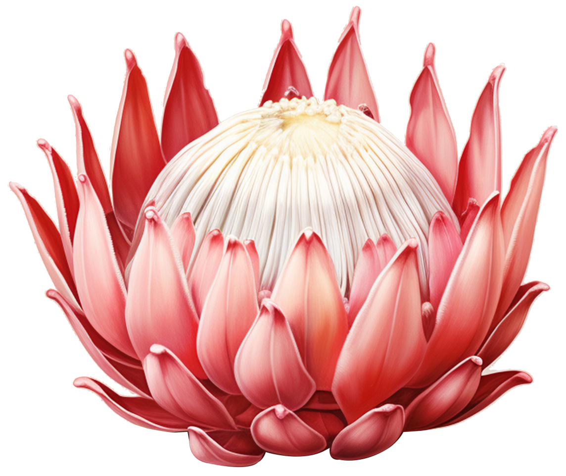
As the brand focused on South African skincare, the iconic King Protea – South Africa’s national flower – was chosen to reinforce its local heritage and authenticity.

Brand values:
With an emphasis on natural and organic skincare, a botanical motif was incorporated to symbolise nature, vitality, and healthy growth.


Playing around with other concepts
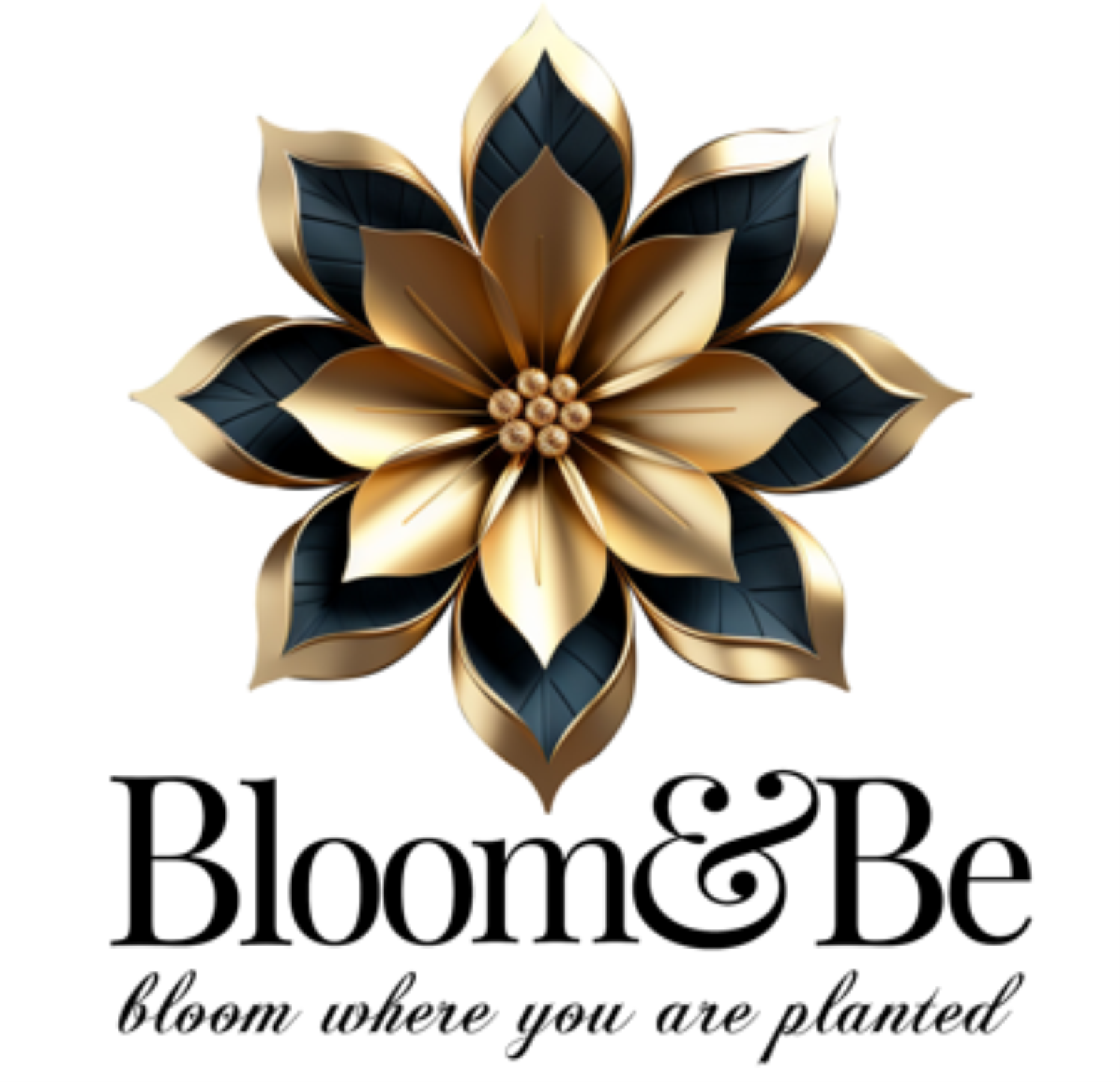
One of the initial concepts centred on
the idea of
“bloom where you’re planted.” We explored a floral motif to reinforce this message and developed several stylised flower concepts, as shown to the left.

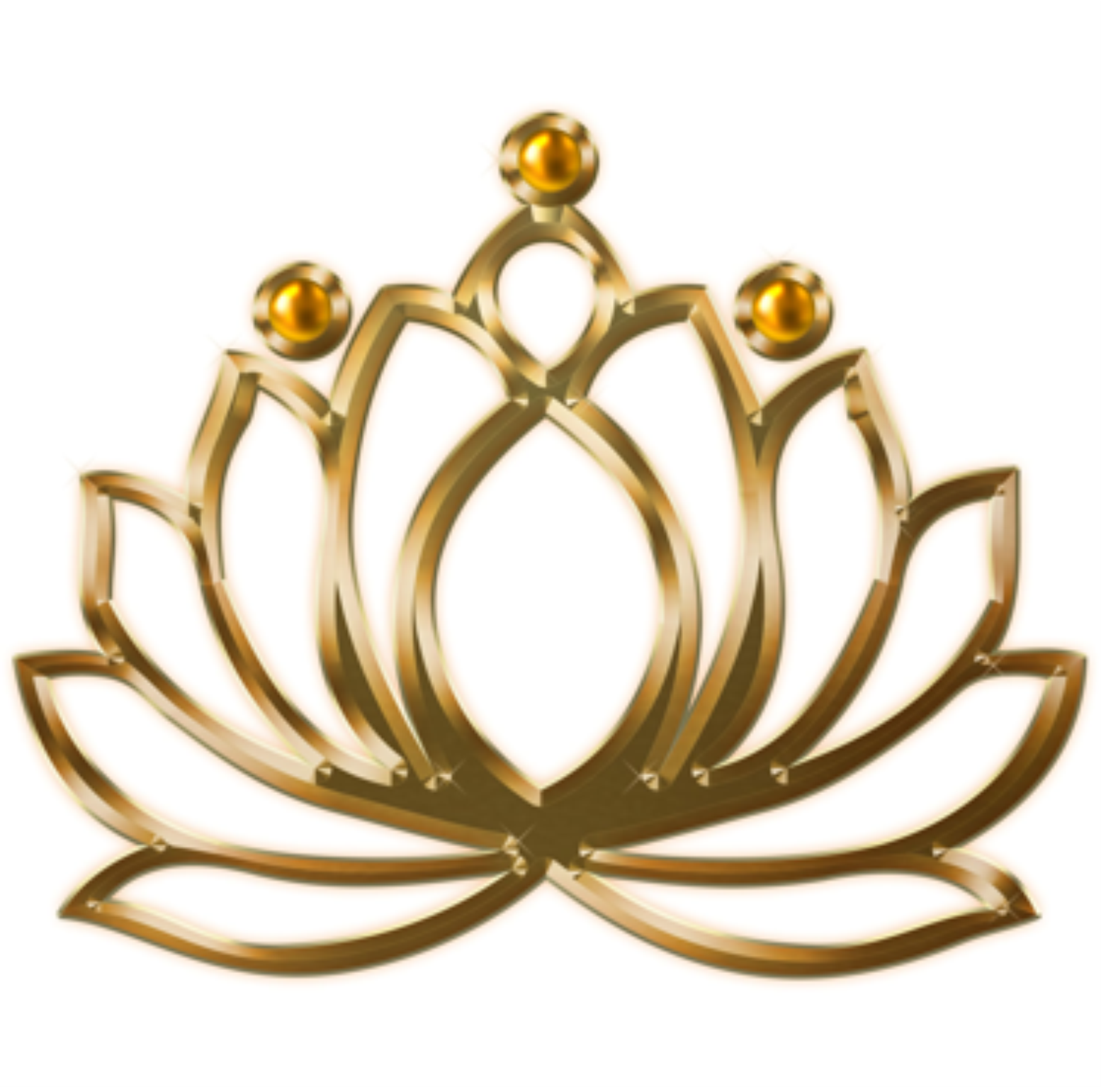
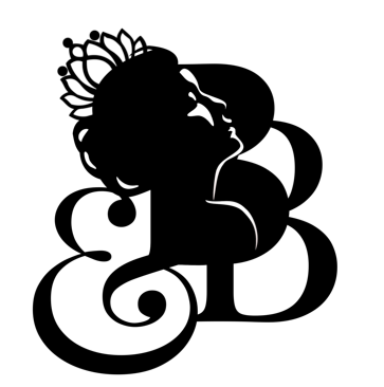
Another direction explored themes of queens, royalty, and elegance. Stylised crown concepts were created, drawing inspiration from the form of a water lily to subtly incorporate a botanical element.

The Queen concept was developed further by combining a lotus/water lily -inspired crown with a black-and-white silhouette, using light and shadow to create a refined, feminine aesthetic.

Once the King Protea was selected as the primary brand symbol, concepts combining the flower with the Queen motif were explored before ultimately refining the logo into a simpler, more timeless design.


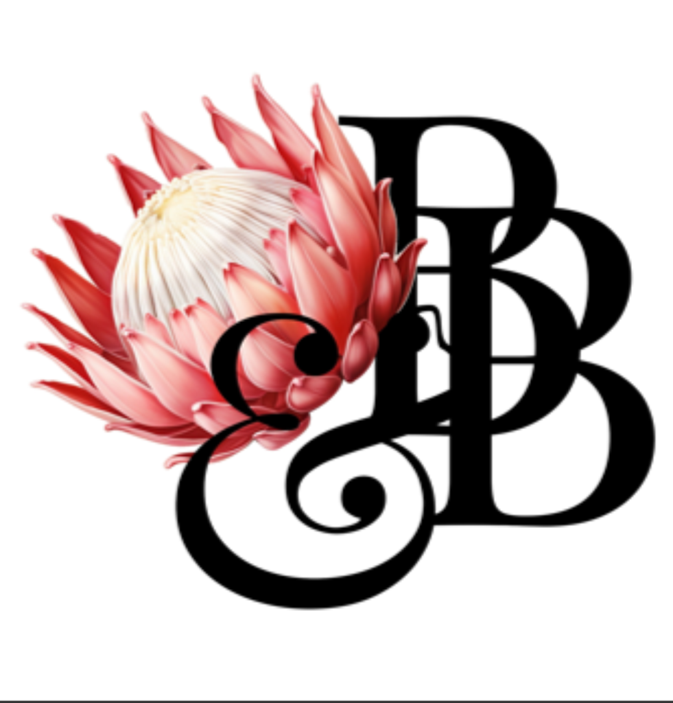
Playing around with layout once the main elements were decided
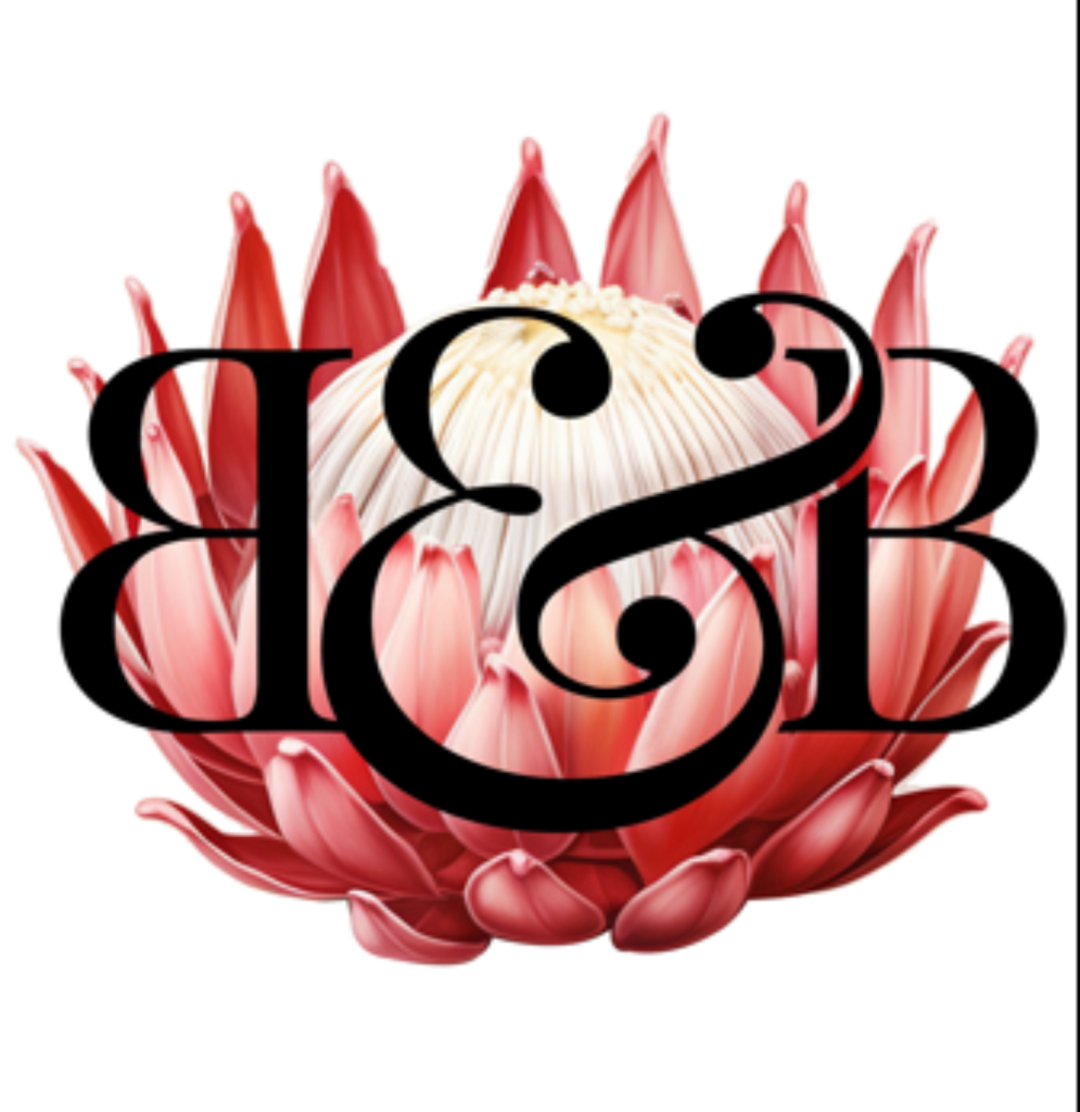

Playing around with layout once the main elements were decided
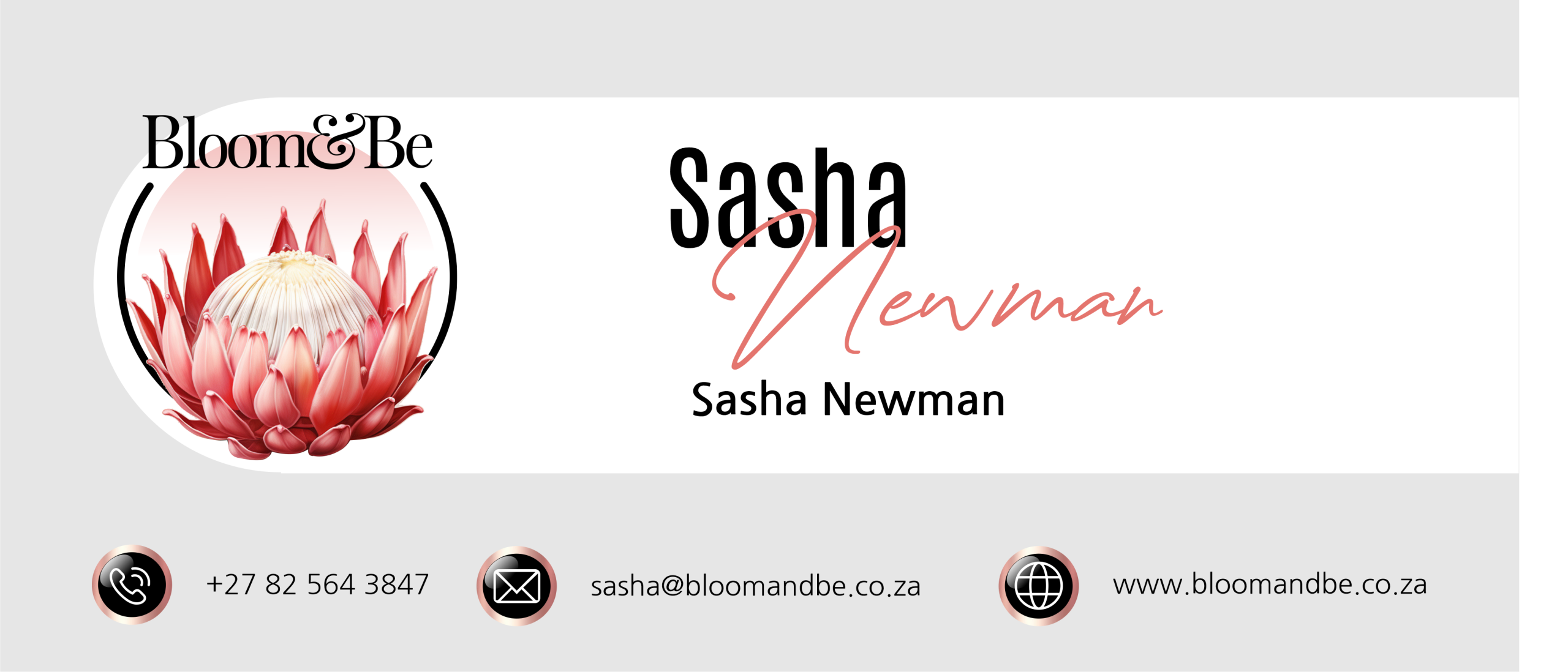
Email  Signature
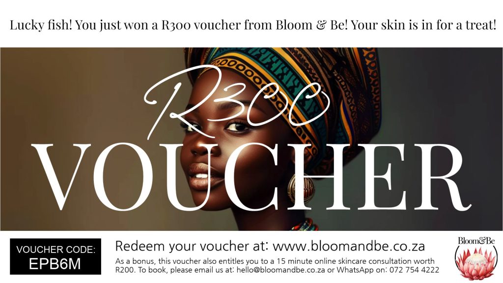
Vouchers

Company Introduction Video